Wednesday, June 01, 2011

Gallery 110 exhibit, Seattle, June 2011

Here are the four sculptural books I will be showing at the June exhibition at Gallery 110:


Clockwise from top left: Superfoodland!, Tenuous Connections, Random Cruelty and A Dog's Tale.

Exhibition details:

Past Journeys/Present Tense
Gallery 110, Wed-Sat, 12-5pm
Artists' Reception, June 4, Saturday, 5-8pm
110 3rd Ave. S, Seattle, WA 98104

You can read more about the three pillow books on my website following these links: A Dog's Tale, Random Cruelty and Tenuous Connections.

Process photos for Superfoodland! are here: gocco'ing the cards, painting the board, polymerclay utensils and polymerclay blueberries.

Process photos for the pillow books (among other things) are here.

Friday, May 13, 2011

Mr. Seahorse

This is the result of a failed experiment. But yes, I like it. I see some possibilities for it.


Gouache & white pastel pencil on gampi, sandwiched between 4 sheets of gampi glued together with GAC 500. So there are 5 layers of gampi all together. Shot on a window.

In my previous experiment, I played with using Chinese mulberry paper to paint/draw on, and then attaching it to a gouache/acrylic surface. The mulberry paper is thin, but only slightly transparent (as you can see in this entry; it was also really easy to handle, and it dampened very easily and evenly.

So today, I tried doing the same thing with a gampi paper that is known as 'Japanese silk tissue.' It's not silk, it's a gampi fiber made into a super thin, fairly transparent paper. it's often used in conservation work.

So first, I made 2 sets of 2 swatches, one of the Koh-i-noor watercolor pencils and another of the gouache (I didn't bother with the pastel pencils this time). Attached it to a gouache/acrylic scrap using the spritz & dust method using wheat paste. For the most part, it's really hard to see where the swatches even are! And it was very difficult to dampen the paper evenly; the paper was also harder to handle after dampening. And with the paper unevenly dampened, it's not uniformly transparent throughout. It's pretty much impossible to see the Koh-i-noor swatch (on the left).


While the swatches were drying, I also started the seahorse with gouache. The paper puckered and stayed puckered. I started with a very watered down black+brown pigment and finished it with a white pastel for highlights. This is shot attached to newsprint.


At this point, looking at the swatches drying, I decided to not bother collaging the seahorse onto another drawing/painting. Instead, I decided to sandwich it between more layers of gampi, and the result is the top image.

I can definitely see some possibilities for this, maybe in a book, or in a sculptural work.

Thursday, May 12, 2011

Ms. Potato Head

My friend and fellow artist Catherine Alice Michaelis of May Day Press planted some potatoes. And she said that if it was true that you are what you eat, then she would be a potato. So this is the kind of potato that I think she might be:


Gouache & watercolor pencils on Chinese mulberry paper.

It's actually an Ernst Haeckel image that I've shaped into more of a potato shape. It's part of a new experiment that I'm trying. So here it is, earlier in the night, when it's mostly just sketched in with the gouache and I've just started to draw the 'blooms.'


Remember that drawing of a peony that I didn't use for the the 27th & 29th panels? I used it here. The larger drawing was a doodle I made a few weeks back in gouache.

I spritzed the back side of the peony nice and wet (it's done in koh-i-noor watercolor pencils and it did not run when I spritzed it), dusted it with dry wheatpaste powder, flipped it over and pasted it down on the larger drawing. Since the larger drawing was not dampened, it is now slightly warped. The exercise was to see if the spritzing and wheatpaste powder would work as a glue for collage on gouache painted surface when I can't or don't want to brush on the glue. This was a trick Jane Pagliarulo of Atelier Meridian taught me for chine colle, and it works really well here too!

(If I were doing this for real, this would be on a board, or I would've dampened the substrate so it wouldn't warp.)


The experiment started with this -- I made 2 sets of 3 swatches with pastel pencils, koh-i-noor watercolor pencils and gouache. I pasted 1 set onto a scrap (painted w/ gouache & acrylic) using the spritz & dust method, and compared the result to the control set. None of the mediums had problems with being spritzed on the back side, even on the thin mulberry paper. The pastel pencils did rub off easily, but the water caused no damage that I could detect.

Monday, April 25, 2011

27th & 28th Panels


Ancient History, gouache & acrylic on paper on birch panel, 14" W x 7" H

Another diptych, but this one actually started out as a vertical. I was playing around a lot with this. This was created with dripping a lot of paint onto the paper and then using a hard brayer to move the paint around. There were several iterations of this, each time with a different color, all fairly thinly mixed. Sometimes I would let the paint sit for a bit before I took the brayer to it, other times I'd do it while it was fresh.


I think I turned it horizontal fairly early on though. Having decided that it was a landscape, with a bit of sky showing down the middle. I brought out the land formations. Then the last issue of the Thursday Home & Garden section had a story on peonies. I saved the photos and was doing some drawings based on the photos. Heck, I might as well put the peonies right on the piece...


I was watching a video of another artist working and was inspired to try some of her techniques. She works in encaustics and makes drawings of individual elements and then collage them onto her final piece. I know a lot of artists use this technique, but her work was the first to really knock me over. Her pieces are cohesive, integrated and complex, all the while maintaining that luminous look. (See Lori Field's website.)

Although I don't use encaustics, I figure I'd try out the technique — not sure where I wanted to go with this piece at this point, I made a separate peony drawing on mulberry paper, cut it out, and was playing around with placing it on the image. In the end, the additional peony wasn't doing it for me, and I really wanted to see the land/rock instead.


I considered putting a couple of giant praying mantises on there, but in the end decided on some pre-historic looking ferns. And that's the top photo. If you click on it, you can see the details on the larger version.

Thursday, April 21, 2011

Thumbtacks...a lot of them!

I have no idea where this came from, but for a couple of weeks, I kept on seeing drawings and paintings of thumbtacks in my head. I tried to ignore them, but I kept on seeing them. I hope I'm not developing something weird. But anyhow, I finally decided that I should just do a drawing of thumbtacks:


Took me over 10 hours to fill up this sheet of 26"x40" Rives Lightweight with little drawings of thumbtacks; they're roughly life sized, although I would not say precise — some of them look just like the letter T, and some look like those tags you find on cloths. The color variations and color shapes are random. I mixed 3 colors: silver with red, silver with turquoise, and then charcoal gray, and just started putting down thumbtacks on paper. Now I suppose I'll have to count to see how many thumbtacks there are.

Friday, March 25, 2011

19th through 26th panels...


Lichen, gouache & acrylic on paper mounted on panel, 7" W x 14" H

OK, yes, I'm still working on those 7x7 panels. Lichen was finished tonight, and they would be the 25th and 26th (out of 30).

These two below were finished last October, and comprised of panels 19th, 20th, 21st, 22nd (seen here, here and here), and also 23rd and 24th (in progress here).

I made 2 triptychs out of them.


Hummingbird I, gouache & acrylic on paper mounted on panel, 21" W x 7" H


Hummingbird II, gouache & acrylic on paper mounted on panel, 21" W x 7" H

I actually started two more hummingbirds, but they didn't make it. They turned into Lichen! See above.

Wednesday, March 16, 2011

Something about a peacock?


Untitled yet, but might be something about a peacock. [OK, this really looks way more like a duck, so maybe something about a duck?]

Gouache on paper mounted on board (will soon have a coat of acrylic over it too)
12" x 12"

So this piece took me less than a year to complete! (Took about 12 days from start to finish, and I was up until 3am on many days working on it.)

I was inspired by this dress, called "The Wave", and you can see the ad I clipped out of the paper on the left. I'm obviously using the image in a rather, ahem, loose manor, as it barely has any resemblance to the dress. I really wanted to do a piece where the colors are not so intense (like the last piece); and I also wanted to do a piece where I leave some white space. I seem to be incapable of leaving white space, so I wanted to do that. And that turns out to be barely manageable—leaving white space, that is—but I left some. Maybe I'll do better on the next one.


I love the idea of looking at what seems like an infinite world, either through a microscope or through a telescope; I don't think I'll ever tire of doing that. Even without the aid of a scope, the world we can see through our naked eyes is so full of life known and unknown. I like the ambiguity of not knowing what I'm looking at, the juxtaposition of possibilities, of the microscopic, the cosmic, and of the everyday garden variety of life.


I also like the ambiguity of animate and inanimate objects...are those flowers or rock formations? Or maybe mushrooms.


At this point, I was thinking maybe this was a rock that was blowing fish eggs out of its mouth, but it really just looked too much like a peacock for me to ignore it. So a peacock it became. (See top image.)

Sunday, February 20, 2011

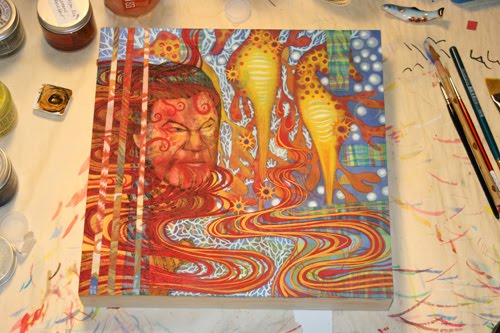
They've Got Gold Trouble


They've Got Gold Trouble (temporary title, still considering other options)
Gouache on paper mounted on board (it will soon also get a coat of acrylic on top)
12" x 12"

Apparently, it took me exactly one year to finish this painting. (Well, I finished it sometime after midnight, so I suppose technically it was a year and a day...)

Looking through my archives, this first photo was taken Feb 19, 2010, and this was how this painting started — a pour and 3 spritzes with a water bottle that created the 3 bulbous spots:


I didn't work on it again until October of 2010, when I needed a demo piece for Portland Open Studios and I thought this looked like a demo in the making. During the two weekends, I worked on this on and off in between talking to people. I really didn't have anything in mind, it was meant to be a demo piece, something I could do while talking at the same time. But I wanted to preserve the three bulbous forms, I really liked those, for whatever reason. And at the end of two weekends, I had:


It was January, 2011 before I got back to it, hoping to finish it in time for the PCPA exhibit, but I didn't finish in time. The bulbous forms turned into seahorses. I hadn't ever done seahorses before, although I've always love them and have a collection of images I've kept from my 30 years of Natural HIstory subscriptions (my 20 year old neighbor was really impressed that I've subscribed to a magazine for THAT long):


Betwen January and February, I worked on it on and off between putting together 3 other applications. And then I got pretty well stuck on it. I had decided that the three seahorses were really Rheinmaidens (I saw Das Rheingold at the Met Simulcast somewhere along the line in there), but I really didn't know how to proceed from there.

When I get stuck on something, one way I get myself unstuck is to do something 'drastic' in red. In the past, I've poured red over an entire piece, I've poured red over most of a piece, but in here, I've made red waves. It's just something that forces me to react and to do something other than to sit there, stare and wonder what the heck I'm going to do next.


From Valentines Day on until Saturday night, I worked on it pretty intensely, while listening to the BBC news about the protests in North Africa, Middle East (and Wisconsin). How much does that have to do with the finished painting? I don't know.

Although I managed to preserve the bulbous forms (at least two of the three), I lost the lines of drippy paint in the process. I wanted to bring those back...and so I did, in the final stage (top photo).

Sunday, January 23, 2011

Zen or Frou-frou?

Another month passes by and I've not documented. Not because I haven't been working. It's true that I don't have a lot of completed projects to show yet though. But I did kind of finish one thing last night—after going charcoal gray on my website for a year, I decided that I really liked the white background better, so I made the switch. (With some small amount of guilt, since the dark charcoal background consumes less energy...but really, how many people are looking at my website anyhow?)

While I was at it, I also investigated various javascript lightbox libraries and used one for the 4 Painting pages on my website. The Prints and Artist's Books pages still use popup windows, since they have a lot more information associated with them and some with multiple images and buy options. I'm still deciding if I can switch them over to the lightboxes and how to include all the necessary information.

Also while I was at it, I added some new images, and got a lot less wordy. I can never decided if I'm zen or frou-frou, that goes for the house and the website. But I'm probably something in between...boring, mainstream, or the Confucian way?


It's not a coincidence that I mention 'house' and 'website' in the same sentence, as I've also been working with an architect on getting some much needed work done. Case in point, someone who came to the paper sale yesterday told me that we REALLY needed to do something about the deck! And so we are.

I'm painting; just don't have a finished painting to show yet. It's gone from "love" to "disaster" and now I'm back up to "like."

I'm working on someone's website. Hopefully that will be done soon.

I'm also working on a proposal for a residency to create an outdoor installation.

So plenty going on, but not much to show yet.

Friday, December 17, 2010

The Laundry Maze

I'm tempted to make a “laundry list” (ha!) of all that has happened in the last 3 months, but I think I'll just focus on The Laundry Maze instead for now; it's the latest development, the news from today.

This was a proposal I submitted early November before I left for a 3 week vacation in Taiwan. It's for a Portland Building installation. I just got the call this morning that my proposal was accepted, and I'm scheduled for early 2012. That seems far away, but not really so much. I am thinking about 2012 already as well. So here's my proposal for The Laundry Maze:

The Chinese laundry is an iconic thread of early China-to-US immigration story. It was a small business that did not require a lot of start-up capital or spoken English, neither was laundering seen as a desirable job, and therefore the business was easily passed on to immigrants without much controversy. Although the laundry business, the US economy, and the immigration patterns have all changed a great deal in the last 100 years, it is still a line of work that many immigrants find accessible regardless of their professions in their countries of origin. It is particularly true if one looks at the ‘laundry’ business in a broader sense—from dry cleaning to housekeeping of the hospitality industry, and also private housecleaning services. As our professions are such a large part of our identities, this transition in profession also brings about a change or loss in identity.

Starting with this connection between immigrants and ‘laundry,’ I propose to install The Laundry Maze in the Portland Building. Resembling lines of clothing hung out to dry, The Laundry Maze will document these profession transitions and invite the viewers to participate and share in this loss of identity.

Clotheslines will be installed in a grid pattern; clean shirts, blouses and t-shirts will be hung in such a way as to create an entry and an exit through a very simple “maze.” I will collect data from immigrants about their professions in their countries of origin and also here in the US. Each pairing will be inscribed on a piece of clothing that is hung on the clotheslines and will be readable from inside of the maze.

When viewers find their ways through the maze, they read & share the experiences in these transitions while their faces and identities are hidden by The Laundry Maze. Only their legs and feet will be visible from outside. As our legs and feet are our most basic methods of mobility, each person is reduced from the whole to an anonymous figure that moves from place to place.