Monday, September 28, 2009

The new 8th


Slightly better than the old 8th. Maybe.

There's very little difference, actually. I thought the old 8th was just a bit too dingy, and so I added a bit more spectrum red and ultra marine to the edges. Although I have to say that now it looks less desert like, which was what I sort of had in mind before, the desert colors. I'm also wondering if it's a bit too red-white-blue-ish. I guess I'll sleep on it some more.

I actually got to this point last night/this morning around 2am or so. Spent most of today doing Portland Open Studios stuff (preparing to ship some tour guides, meeting minutes), and also getting ready for my 3rd session of the solarplate intensive with Barbara Mason tomorrow. I have some etchings from our 2nd session that I haven't scanned in yet. I'll do that sometime. Tomorrow, I want to do some relief prints.

8th


Am I done? I'm not sure yet. I'll sleep on it.

Thursday, September 24, 2009


For those of you who don't facebook—I figure this means that the gods think I'm flossing and brushing right. And for Shu-mei, who can't believe that I noticed this—I just spat out my toothpaste, I had my face in the sink, I was staring right at it, how could I NOT notice?

Unfortunately, the last couple of days have not been productive in the studio. For some reason, I had bouts of stomachaches all day yesterday. On and off, and through the night. Thank heavens it didn't continue today. And today was mostly a Portland Open Studios day. Shipping out tour guides, picking up tour guides, incremental updates on the website. I still haven't finished Kate's profile.

Tonight was the China Council's annual membership meeting/dinner, so that took up almost 5 hours! For a meal! Well, ok, there was a talk too, and this year, by the Portland Art Museum director, about the new exhibit China Design Now. I'm sure it was an interesting talk, but unfortunately, I did not have a very good seat—the last table, close to the rest of the restaurant which had diners not involved with the event, and the other Chinese patrons at my table kept on talking to me through the talk. Yes, this is always a problem—while the speaker is talking up there, half the Chinese people in the audience are having their own conversations. I can't exactly just ignore them when they say something to me, and if I respond, it just keeps the conversation going. What do you do?!

Tuesday, September 22, 2009

7th


Queen Bat and Her Royal Jewels

Going to Bend knocked me off my painting track for a bit so I had a chance to catch up on some Portland Open Studios chores. You can now buy a tour guide using PayPal, and I'm also working on another feature, and an artist profile.

Got back to my bat this afternoon (see this entry for where it was last I worked on it). I'd say this is a worthy facebook picture alright!

For those keeping count, this was another 5 1/2 hours of work. That makes the total 10.5 hours, excluding preparation time. I prepare the boards a bunch at a time (3 coats of gesso then mounting paper), so it's hard to track how much time it takes per board. I'd guess maybe 15 minutes. Of course, I'm not done-done yet—I have yet to spray it with the GAC500 mixture. Again, I'll batch that step of the process too, so we'll say it's another 15 minutes. Which brings us to a grand total of about 11 hours.

Wednesday, September 16, 2009

Half a bat...

I was hoping to get my 7th panel done today before I head over to Bend to see my mom tomorrow, but well, it's past midnight and I must go to sleep now.

I've wanted to do a bat image for a long time now. The other day, I was going through my books of images with Susan (who's doing a bat pin for me), and I got inspired by all the bat photos all over again. And after my 6h panel, which was very red, I wanted to do a blue image. So a bat at night seemed like the perfect antidote to panel #6.

Here's how it started this afternoon:


And here's where we're at tonight.


This is a fantasy bat. Some fruit bats do have extremely fancy noses and others (the ones that hunt) have extremely fancy ears. So I've combined the two. I think it's looking very Balinese, which is not intentional. It's also looking a little grimlin like, which is also not intentional.

For a change, I'm happy with how the panel is going, and I don't see any major revisions in its future. But maybe that's bad?

[And people always ask, so...it took me about 5 hours to get to this point, which does not include the preparations part. And for the most part, I'm painting with a size 0 brush.]

Tuesday, September 15, 2009

6th


Going Around in Circles

This piece has had a rough life. It started out as this (you can still see this pattern in the finished piece above, sort of):


Which I decided I really didn't like. So I brush an earthen red all over it:


Before it finally arrived at its current state, which is the 1st image above.

Another fairly labor intensive piece. This was a 4-part repeating image, created using the same basic method as the 6-part repeating image here. I have to say that the 4-part repeat is a lot easier to do than the 6-part repeat—the 4-part repeat is at least symmetrical, which is a lot easier to deal with.

But as you already saw above, I did not care for the resulting pattern, it looked kind of crudely done. Even though it wasn't finished yet, I had the nagging feeling that I could put 10 more hours into it, and I'd still see it as kind of 'crude.' I'm not sure why, maybe the pattern was too large?

Friday, September 11, 2009

5th bir...


I'm getting tired of typing out the whole 'birthday present to myself' thing now.

But anyhow, of the 5 panels done, this was the most time consuming. Not because it was difficult, but it was labor intensive. I'm figuring that this was about 12 hours of neck-cranking, carpal-tunnel-damaging work. Here's how the piece started:

I divided the square into 6 parts and did whatever I wanted in one of the parts, and here it is:


Then I took a photo of it and used photoshop to replicate the other 5 parts. I printed this out in black & white and trimmed it down to size. Then I took a charcoal stick and blackened the back side of this printout and taped it to the painting. Then I used a pencil and marked some of the key spots so that I can replicate the image. The charcoal transfers to the painting, sort of, at least enough for me to locate where things are supposed to go. Then I remove the printout, keeping it taped to the edge of the painting so that I can always flip it back on the painting to locate myself again, as necessary. And it was often necessary.

I am undecided about the orientation at this point, and the Good Prince has been pretty busy so I haven't asked him for an edict on the subject matter.

[I should add that the background colors you see in the beginning stage photo—that was put on there days ago, before I had an idea of what I wanted to do. It just so happens that I'd been itching to do a 'kaleidoscope' piece for a couple of days, and here was this panel that was already kind of divided into 6 parts with the bright center spot. I also want to do a 4-part and an 8 part image. I kind of think the 6 part image looks a bit like a face, probably unavoidable because the way the repeating happens, it will just always have that '2 eyes and a mouth' look.]

4th birthday present


This is searching for a title. And I'm having too much fun.

Tuesday, September 08, 2009

Solarplate intensive with Barbara Mason


This is a 5"x7" test solarplate intaglio printed on Rives Lightweight. The yellow stripe down towards the left is from the scanner (I despise this all-in-one scanner/printer/copier).

I got a RACC Professional Development grant to do 20 hours with Barbara Mason, and today was my first session. For the first session, I prepared several tests—

1. The above, which is collection of various line thicknesses from 0.5pt to 20pt, various fonts (serif, sans serif, italics, etc) at different sizes, ultra fine sharpie, fine sharpie, black oil pastel, brown oil pastel and gray oil pastel.

2. A sheet of mylar painted with ivory black at different density levels. We test printed just a small strip of this.

3. A sheet of mylar painted with an image in bone black (which is more transparent than ivory black). But this was NOT dry after 12 hours, so we did not test this today.

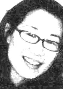
3. A high contrast photograph. We did not test this today, as the laser printer output showed a visible grid, which would image on the solarplate.

4. A low contrast photograph. We test printed just a small strip of this.

5. A B&W positive and negative of a painting. We test printed one of these, although I don't remember which.

Here are a couple of details. Again, the yellow stripe is from the scanner.

I'm pretty sure the fuzziness is from the wiping (this is intaglio and not relief printed). The Rives Lightweight gave the 'cleanest' print as far as the fine lines and texts go. Rives BFK was a little fuzzier (both of these were printed dampened). The Arches 88, printed dry, gave the fuzziest result. Although, both the Lightweight and the BFK showed the slight 'woven' pattern that is visible on the backs of these papers when unprinted, ie, the 'weave' became visible on the front of the paper in the print. And the ultra fine sharpie is barely visible at all.


I love the lines drawn with the oil pastels!


We're scheduled to meet next on Sunday, that will give me a chance to create a few images to print for real (rather than just tests). I'm thinking that I will do intaglio for the first half, and then relief for the 2nd half. I'll be trying the relief plates on the letterpress and also the sign printer that Catherine loaned me. (Yes, I just have all kinds of presses here, on loan from other artists!)

Saturday, September 05, 2009

In either case, there's trouble


That's the statement the Good Prince made about the piece, and I decided that it made a good title.

So this was the 3rd of the 7x7 panels. I was up until 3:15am working on it this morning, followed by another 30 minutes of just staring at it. At one point, I poured brown paint all over everything. Finally gave up and went to bed. Got up at 9:30am, and after my morning activities, went back to work.

When I finally decided I could do no more, I asked the Good Prince which orientation he liked. He chose one, saying that the other made it look like the 'thing' was trying to escape from fire. I said, but this way it looks like a comet is about to hit the house.

He said, well then, in either case, there's trouble.

But I learned something—if you put down a layer of brown, after that, doesn't matter what colors you use, everything looks kind of Indian-ish. As in India Indian, not Native American. Everything gets an ochre undertone, maybe that's what makes it feel Indian.

And after days of sitting for 6-8 hours a day, painting, I think I need a rest.

Thursday, September 03, 2009

2nd birthday present


In honor of Shu-mei, who thought the last one was about slugs. I think I'll call this Dude, They're Serving Free Beer!

Ooops, I just now realized that I forgot to put in the stars. Maybe I'll do that tomorrow. But then again, maybe I'm done.

First birthday present to myself


Remember those 7x7 panels I got for myself for my 49th birthday? I finished the first panel today. [Now titled "Angelita Sluggyfish," after Angelita Surmon who came up with the name 'sluggyfish.']

Tuesday, September 01, 2009

Time to start thinking about Portland Open Studios


Not that I haven't been thinking about it all along. It's impossible not to, having to do the website and the secretarial duties and the Portland Open Studios blog. (Just finished this profile on Kamala Dolphin-Kinsgley a couple of days ago.) But now it's time to start thinking about me in Portland Open Studios.

Helen Hiebert, Diane Jacobs, and I (three from our foursome critique group) are all participating, so we decided to do coordinated hands-on demos for the event. Make paper at Helen's, letterpress print at Diane's, and silkscreen print at my studio.

And we made a little postcard. Got it off to psprint yesterday, in time to take advantage of their 1/2 price postcard sale.